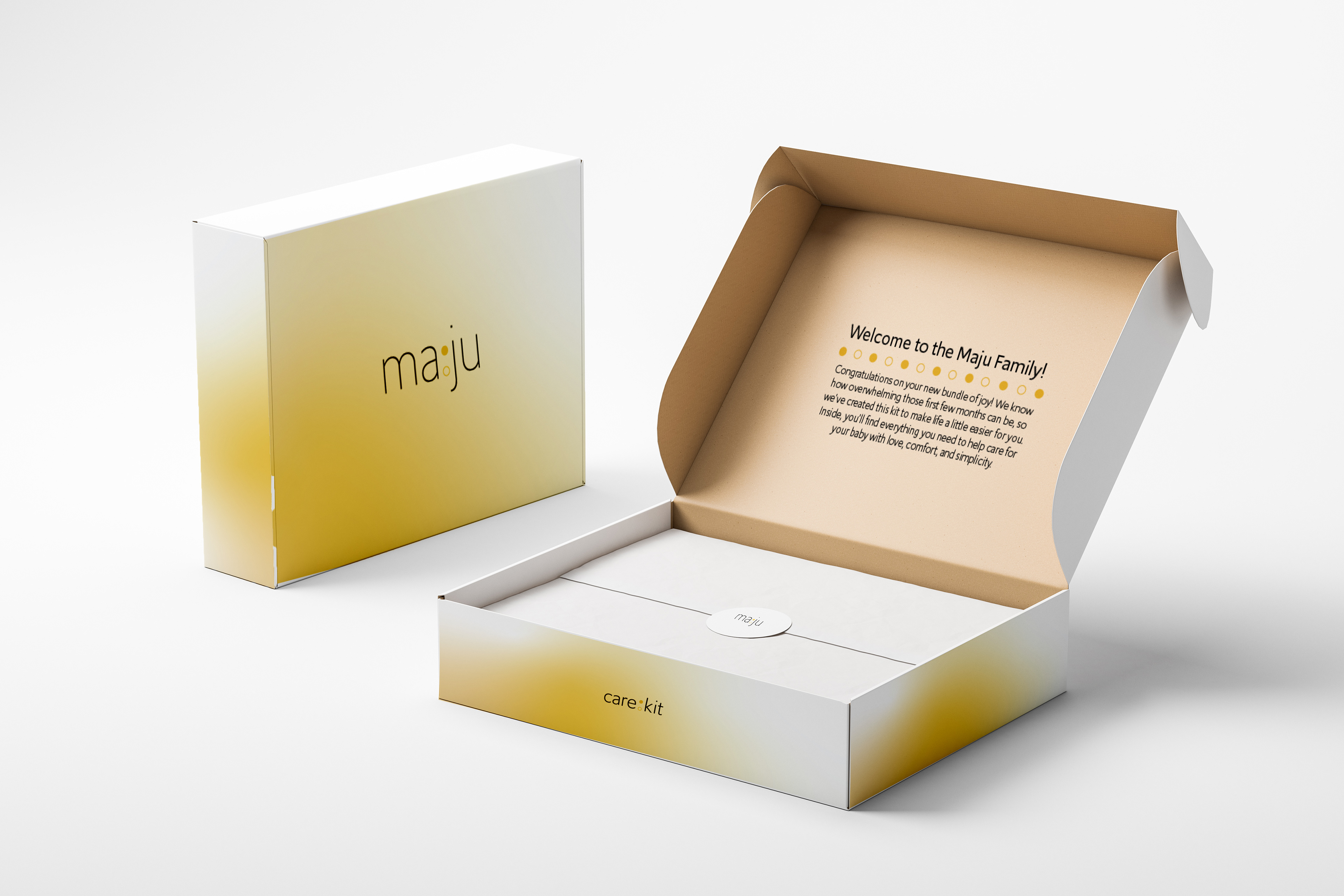
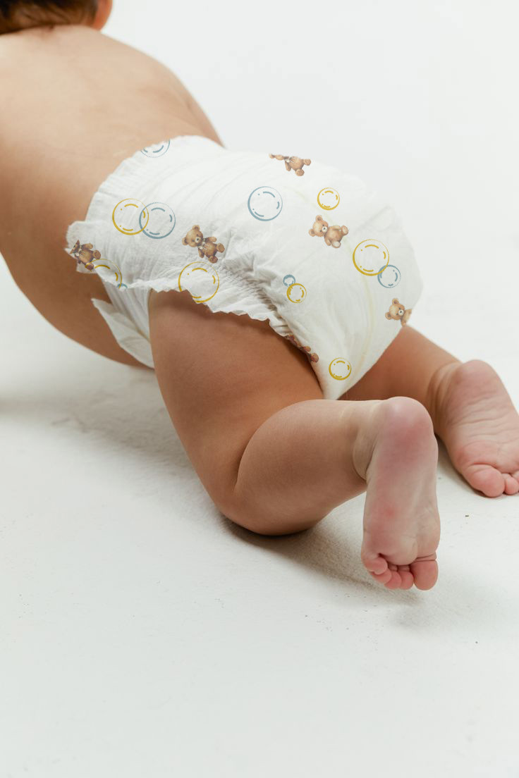
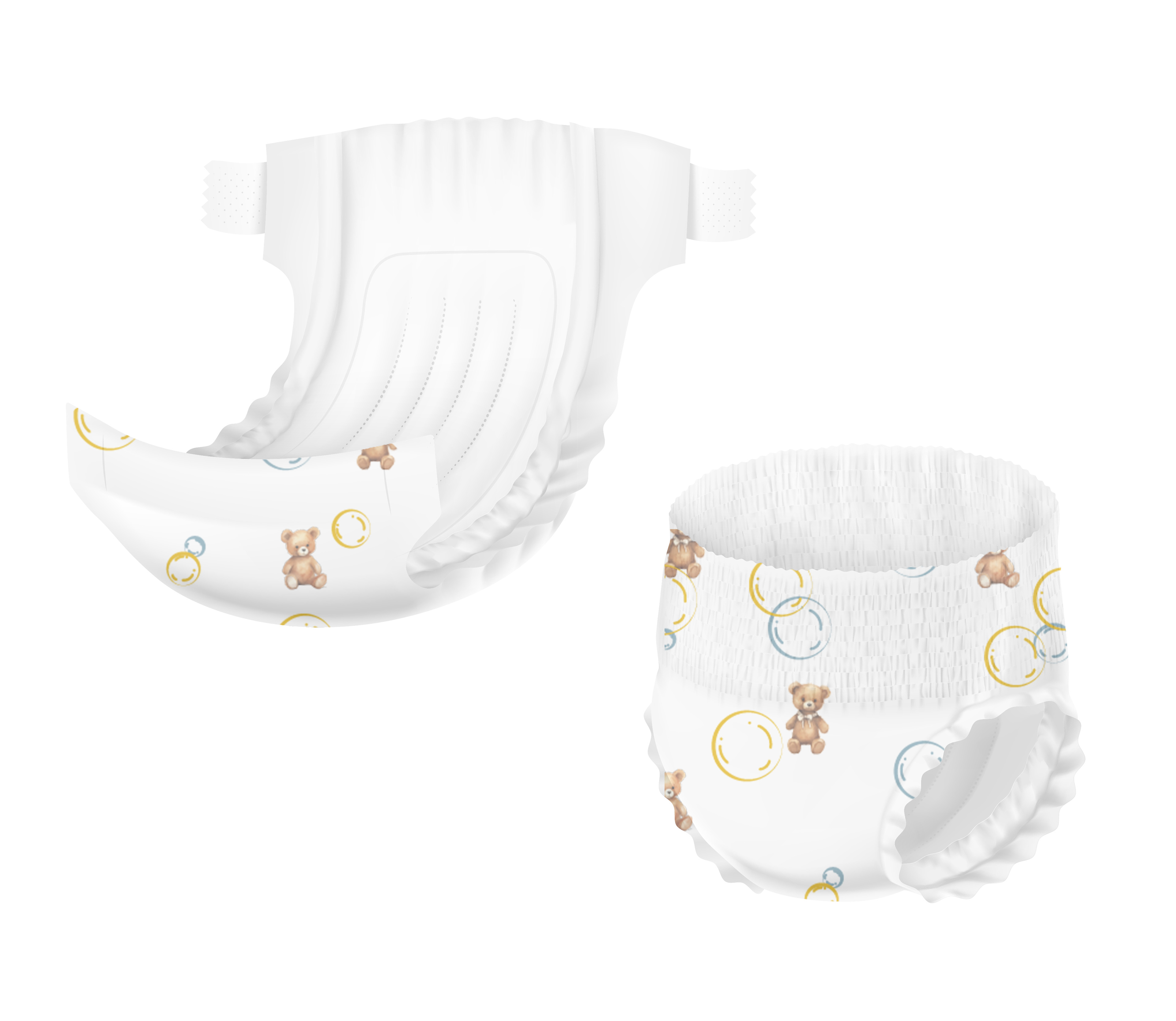
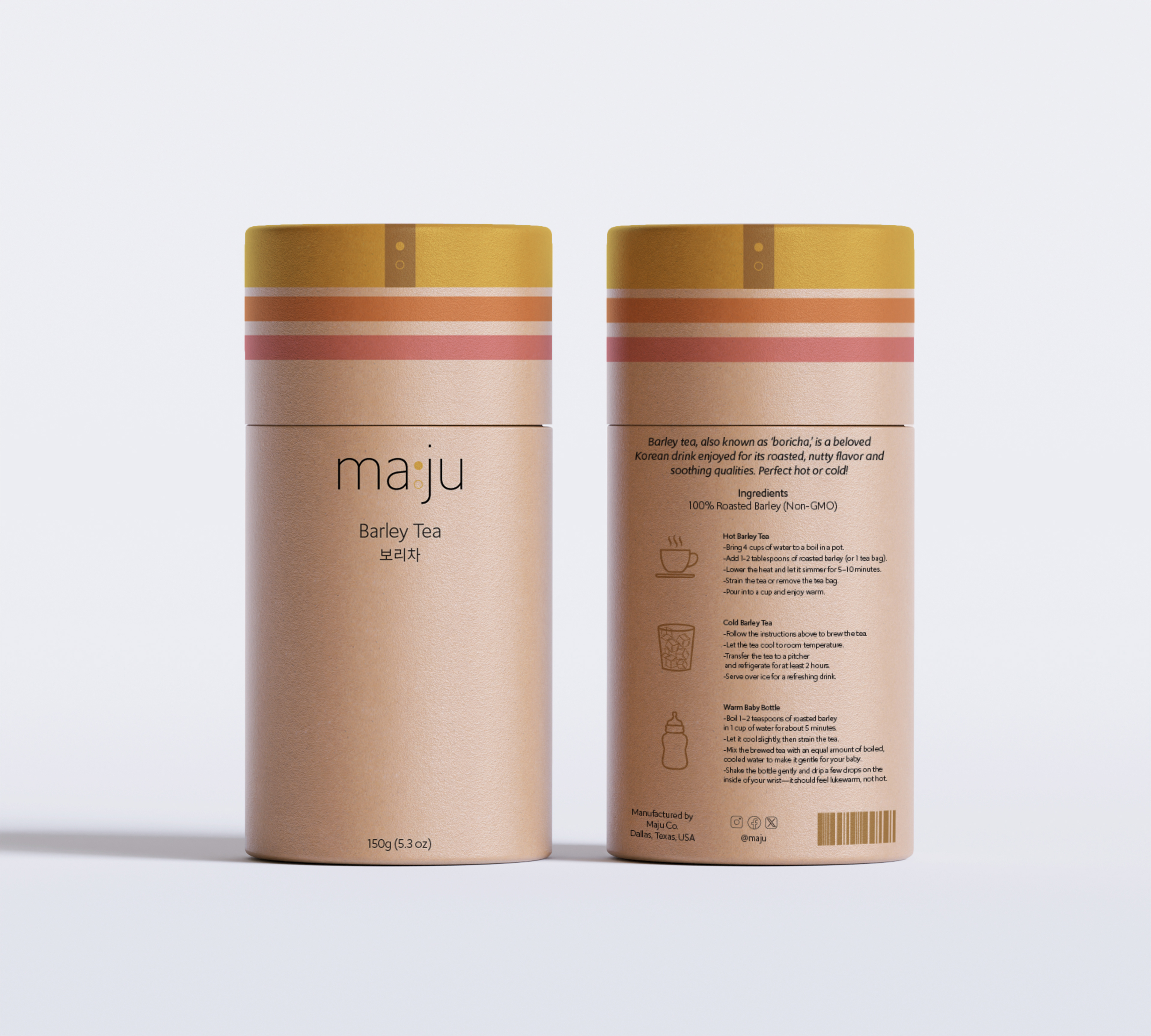
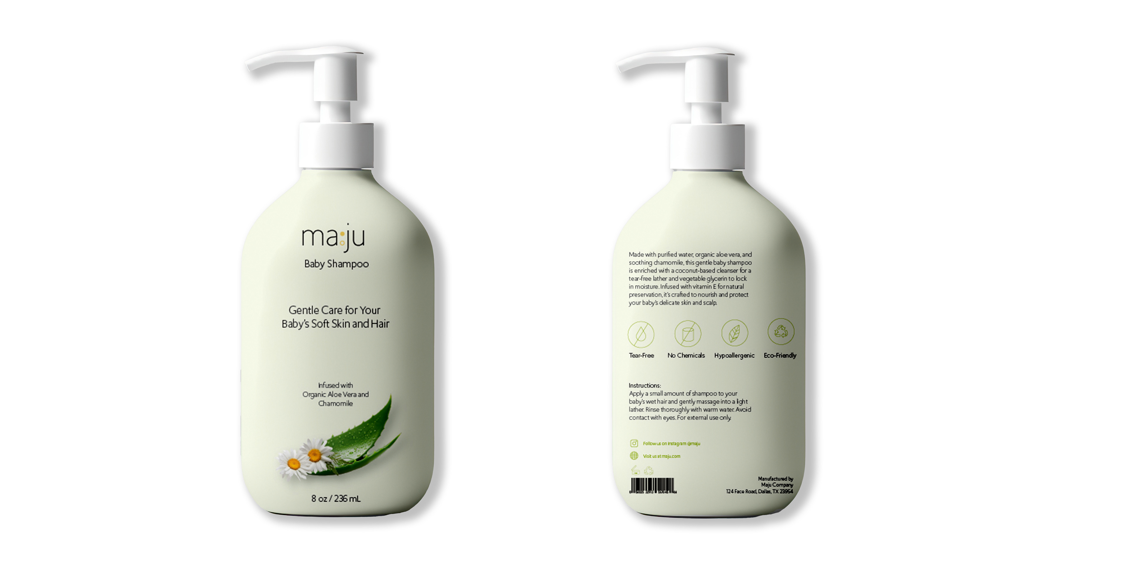
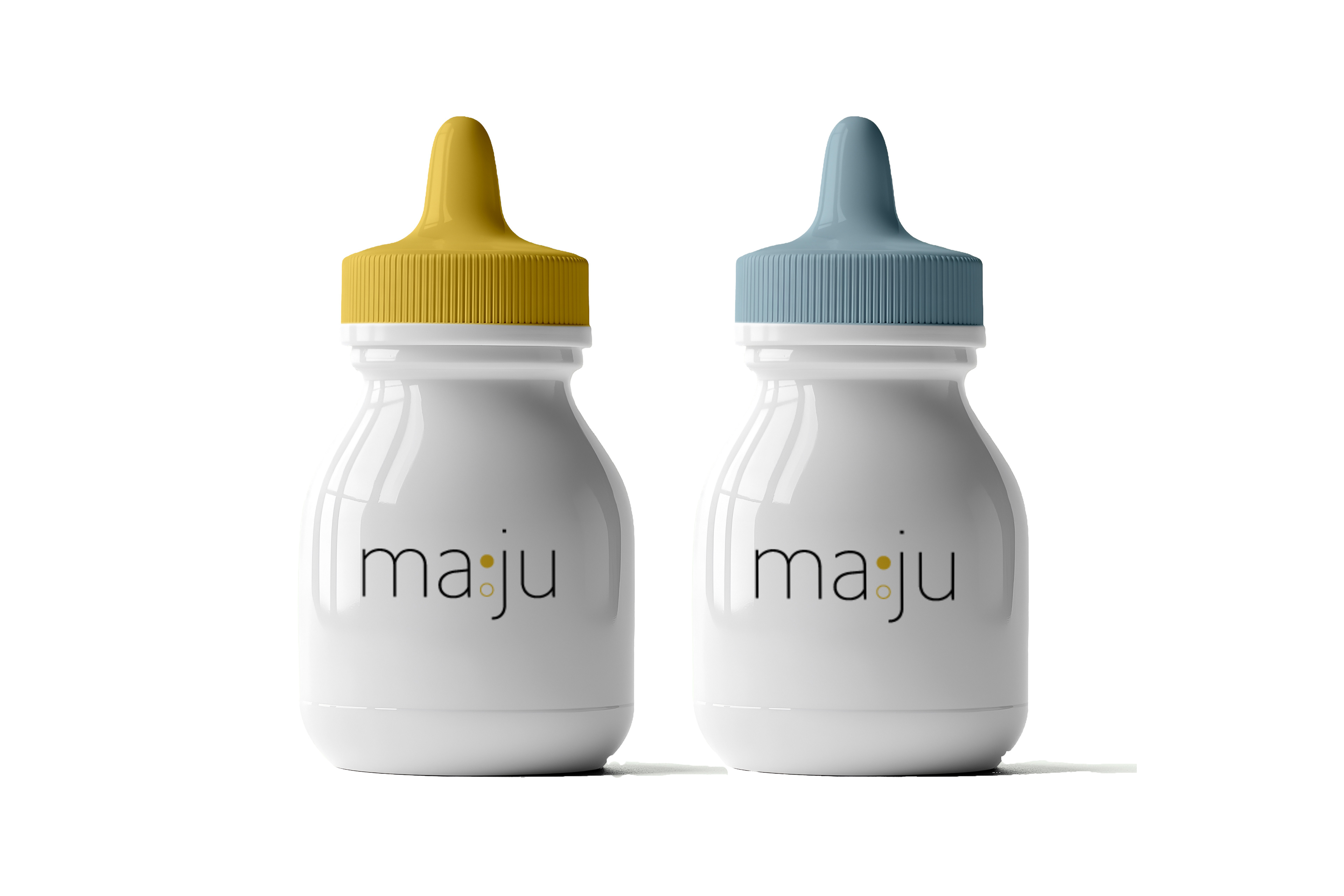
"Maju" is a brand project I created for a class where we were assigned to find a social cause and create branding for it. My idea was to create a brand that makes accessing infant care education for new coming parents easier and welcoming.
I incorporated my Korean background into my brand by naming it "Maju," which means "face-to-face." The name reflects the brand’s mission to foster direct, personal connections, making it approachable, easy to access, and reminiscent of an honest, face-to-face conversation.
Logo Design
The two circles in the design represent a harmonious balance of concepts. The filled circle symbolizes completeness, reflecting fulfillment and the sense of being “whole” that comes from engaging with the brand. In contrast, the empty circle represents openness, signifying receptivity, new possibilities, and a willingness to learn. Together, the circles embody a balanced relationship where knowledge and openness meet, creating a dynamic interplay of growth and connection.